Palette experiments and decisions plus reflections on purple

Clown letter palette for our fucking clown shoes leaders.
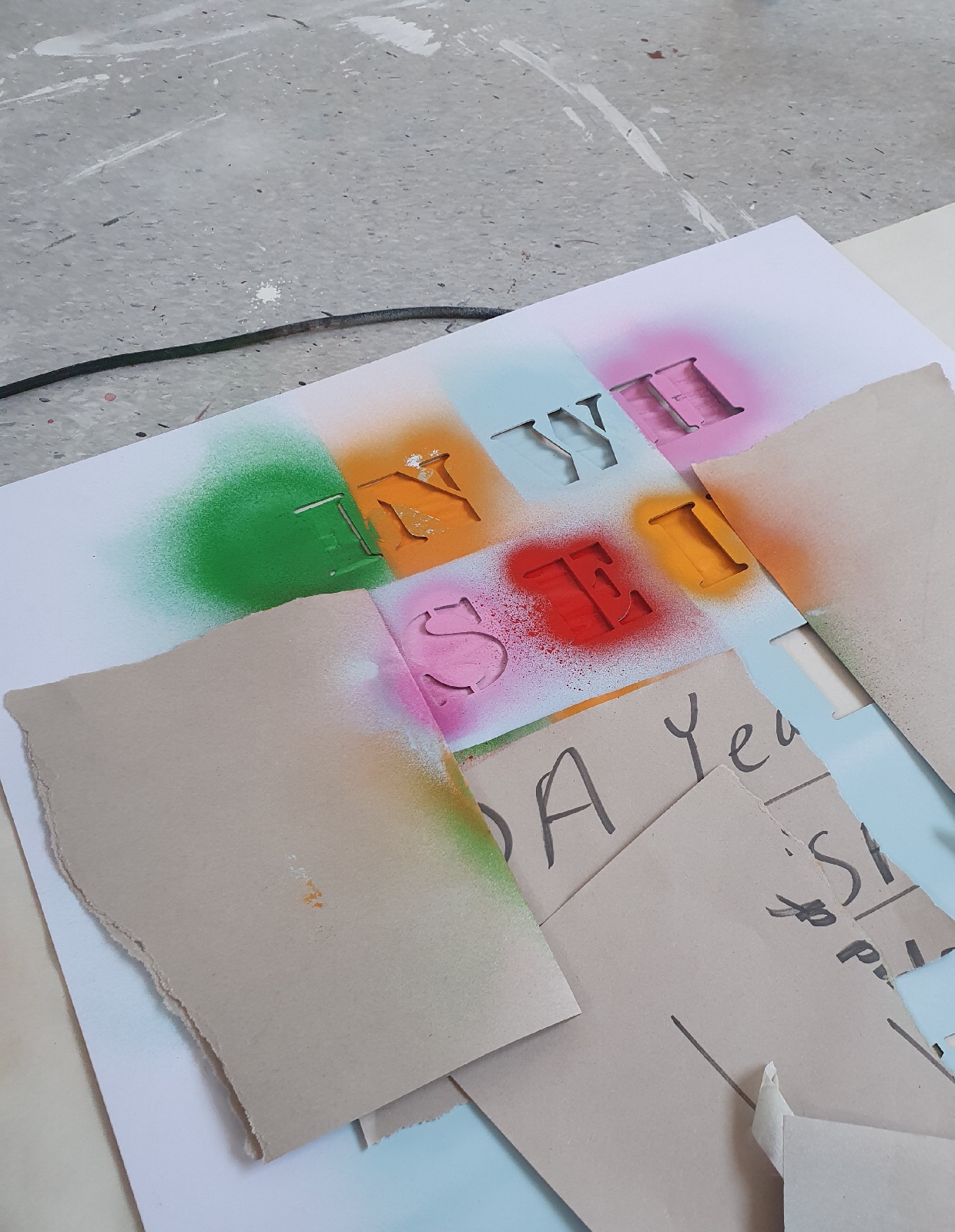
I am experimenting with colour combinations at the moment. I am pleased with how the stencils came out and I like the overspray and less tight elements of my testing.
I am going to experiment more with the process of applying the stencils, with a focus on overworking/ making it all much less tight, like Christopher Wool's work. If I choose this approach, there many be an argument for just doing the lettering in block black.
I will have a think and have a play and see.

After more tests and reflection, I found myself in the sane space with the pallette choice as I'd found myself when refining the overall form of the piece. The inflatable construct of the installation brings more than enough ridicule to the piece already. So what else can the colour communicate.
Initiallt I went back to bubblegum pink. Let's be honest, it's a creative base line and safe space for me. And for good reason.

But just pink on its own felt flat and lost. So I went back to experimenting with new colours and new technique.
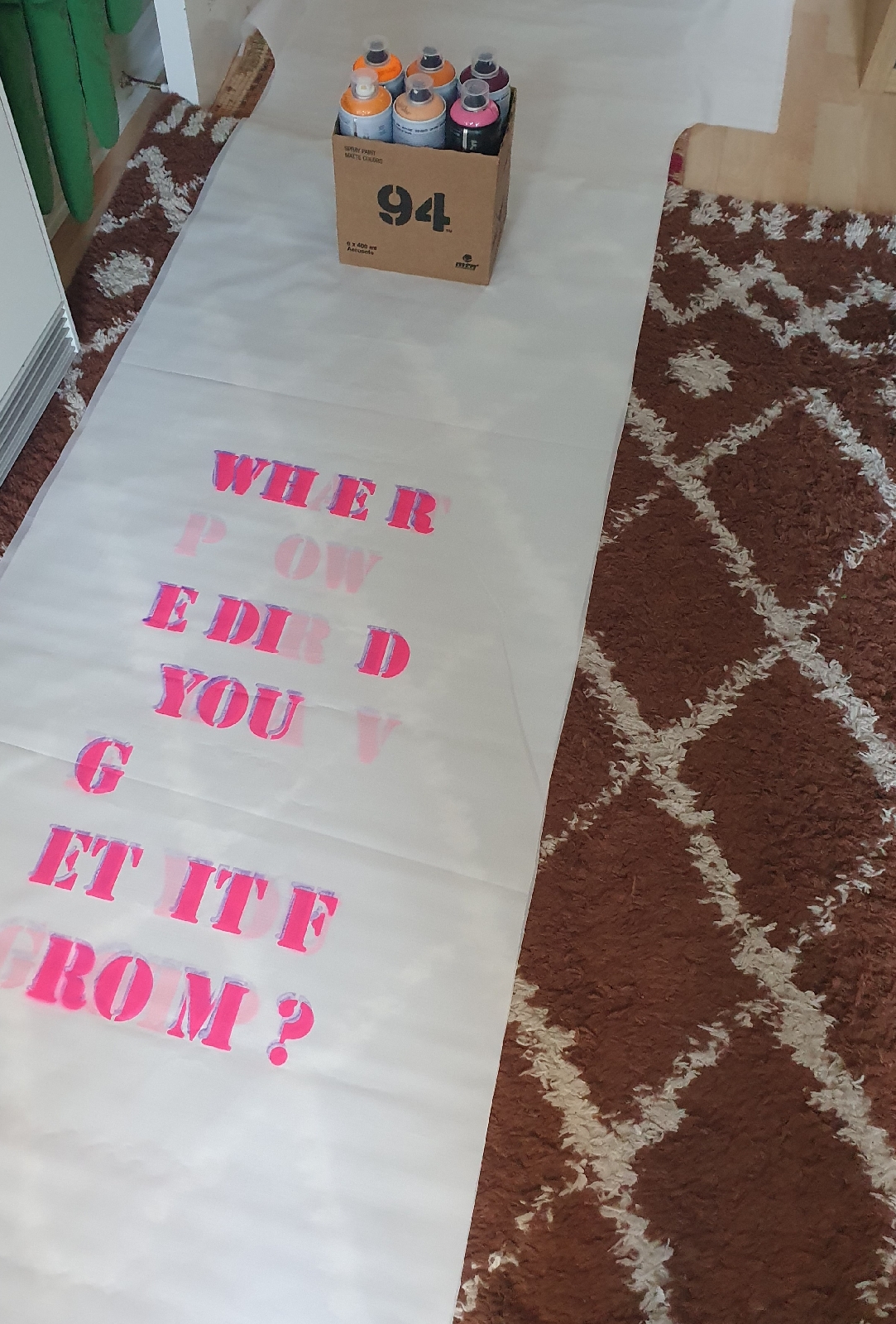
I immediately fell in love with the combination of fluorescent pink as a top coat, slightly offset from a violet purple background in a translucent spray paint, which creates a subtle neon glow effect.

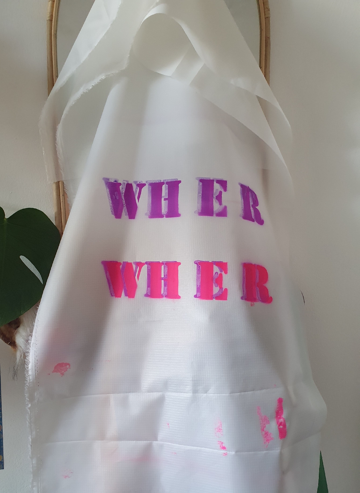

I feel resolved with this choice. Pink has become a part of my visual language as an artist. And the fluorescent quality adds a sense of hazard, hysteria and is just punk. Which all works.
The offset grounds the pink and creates a visual effect akin to stereo. This adds power to the questions on each pillar, making them feel dynamic and alive, almost as if they are vibrating. I am pleased.
Aside from these qualities, the subtle use of purple adds a message of political neutrality. It is truly politically neutral, and therefore universal, because it doesn't appear on any countries flag. This is something that I have been striving for with this piece, offering a politically universal commentary on democracy and humanitarianism. A good friend of ours bought Annabelle a cool book about why purple doesn't feature on flags a few years ago. Cheers Al.


Just as interesting: from a scientific perspective, the color purple doesn't actually exist in the visible light spectrum. It's a color our brains create when they process a mix of red and blue light. This is because purple is a "non-spectral" color, meaning it's not represented by a single wavelength of light like the colors in a rainbow.
It doesn't exist. Just like a lot of things that we think should exist but clearly does not. Like healthy democracy.

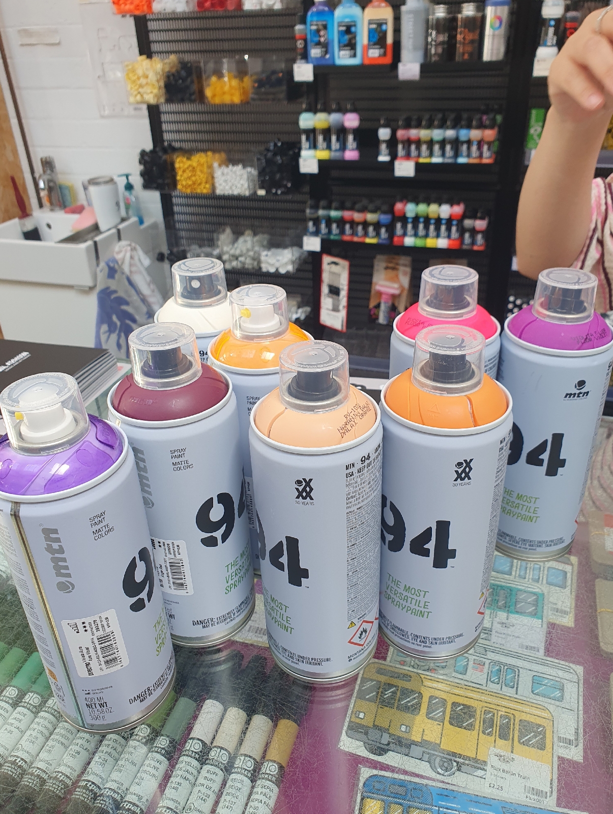
Neon fuchsia and aura violet it is.


Testing, testing. Always testing. Being open, not holding onto rigid ideas and responding as the work develops. Riding out the 2am panics. It's worth it in the end.

